Mosrite Forum T Shirts
-
GattonFan

- Master Contributor
- Posts: 1287
- Joined: Tue Aug 26, 2008 6:36 pm
- Location: St Louis area
Re: Mosrite Forum T Shirts
I would go with either - but I like the full color also.
-
ElTwang
- Top Producer
- Posts: 617
- Joined: Mon Jun 16, 2008 11:51 am
- Location: Copenhagen, Denmark
-
zak

- Senior Member
- Posts: 146
- Joined: Tue May 27, 2008 11:56 pm
- Location: Montreal, Canada
- Contact:
Re: Mosrite Forum T Shirts
Here's my two worthless Canadian cents regarding the t-shirt thing:
I know from experience that color designs drive up the printing price significantly....AND getting them to look good in a 3 or 4 color print is not always easy. White-on-black or black-on-white is definitely the way to go if you want to keep the costs down. If you put the money somewhere, put it into quality shirts and good screening - no one wants to see the thing start peeling after one single wash. Also, looking at what has been posted, no offense but the fonts are AWFUL. Just looks like it has been slapped together with Microsoft Paint. I would chose a better font, something easy to read at a distance, but not something that looks like you pulled it out of a Word drop-down list of fonts.
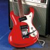
As for the design itself, I would say that usually simpler is better. Seeing sunburst with blue and black on a white background looks kind of cheap to me, not to mention the clash of colors is something of an eyesore and will look awful when printed on a shirt.
If it were up to me, I'd go with something like this:

Whatever you guys decide, chose the font carefully. It will be what makes the difference between looking slick and slapped-together.
I know from experience that color designs drive up the printing price significantly....AND getting them to look good in a 3 or 4 color print is not always easy. White-on-black or black-on-white is definitely the way to go if you want to keep the costs down. If you put the money somewhere, put it into quality shirts and good screening - no one wants to see the thing start peeling after one single wash. Also, looking at what has been posted, no offense but the fonts are AWFUL. Just looks like it has been slapped together with Microsoft Paint. I would chose a better font, something easy to read at a distance, but not something that looks like you pulled it out of a Word drop-down list of fonts.
As for the design itself, I would say that usually simpler is better. Seeing sunburst with blue and black on a white background looks kind of cheap to me, not to mention the clash of colors is something of an eyesore and will look awful when printed on a shirt.
If it were up to me, I'd go with something like this:
Whatever you guys decide, chose the font carefully. It will be what makes the difference between looking slick and slapped-together.
-
mosman
- Top Producer
- Posts: 559
- Joined: Fri Oct 03, 2008 5:52 pm
- Location: Australia
Re: Mosrite Forum T Shirts
Hey Zak,you are bang on the money with your comments and I reckon your design would look killer on a black shirt.
-
Dennisthe Menace

- Moderator
- Posts: 4981
- Joined: Mon May 05, 2008 8:40 pm
- Location: Ft Lauderdale Florida
Re: Mosrite Forum T Shirts
Well, this was why I originally had set the poll up for either Black or White  . This would hopefully keep the price down since there IS a "Minimum Order" on Shirts that must be made to place an order.
I don't think the other ideas are bad, but some of these ideas, including one of mine, will SHOOT the COST right into the Stratosphere. Therefore, I second the motion (if there is one to be made) that Zak IS DEAD ON as far as "staying on focus" with the simple Black or White and concentrate on the better quality Tees and the printing....
I don't think the other ideas are bad, but some of these ideas, including one of mine, will SHOOT the COST right into the Stratosphere. Therefore, I second the motion (if there is one to be made) that Zak IS DEAD ON as far as "staying on focus" with the simple Black or White and concentrate on the better quality Tees and the printing....
make the Mos' of it, choose the 'rite stuff.
.........Owner of 9 Mosrites...
.....proud owner and documented:
1963 "the Ventures" Model s/n #0038
http://www.thevintagerockproject.com/
.........Owner of 9 Mosrites...
.....proud owner and documented:
1963 "the Ventures" Model s/n #0038
http://www.thevintagerockproject.com/
-
dubtrub
- Administrator
- Posts: 3852
- Joined: Sun May 04, 2008 10:12 am
Re: Mosrite Forum T Shirts
I like Zak's logo. heck, I like'm all, so, you guy's decide. 
Danny Ellison
-
zak
- Senior Member
- Posts: 146
- Joined: Tue May 27, 2008 11:56 pm
- Location: Montreal, Canada
- Contact:
Re: Mosrite Forum T Shirts
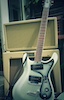
By the way, I wasn't proposing that you guys use that image, I slapped that together in 2 minutes in Photoshop. I can think of at least a dozen other fonts that would work just as well, we can play with the angle of the guitar, superimpose the logo over the guitar, whatever you want. I would just strongly advise against trying to do a "sunburst" in a 3 or 4 color print - it won't look good. Wherever there is shading, different hues of the same color, or fine detail, you will run into problems with printing and having the results look good. "Flat" high-contrast images will work best. I do a lot of freelance graphic design in my spare time (mainly t-shirt designs and CD cover layouts) and I have the software to do it, if anyone wants to submit good high-res pictures of guitars (preferably on a black or white background) I can play around with 'em and try to come up with something...just to be clear, I wasn't volunteering that particular design (I can do a LOT better than that), just using it as an example of what would look clean, be easy to print, and be legible from across a room.
-
Dennisthe Menace
- Moderator
- Posts: 4981
- Joined: Mon May 05, 2008 8:40 pm
- Location: Ft Lauderdale Florida
Re: Mosrite Forum T Shirts
Zak posted:
Zak, I don't think it matters whether you slapped it together or not in Photoshop. Sometimes, you end up with
the best results by mistake. It's simple, it tells someone who we are and what we represent Point made, done .
.
I kept "visualizing" the MosriteForum.com superimposed on the Fretboard, sort of like the Joe Maphis/Larry Collins era,
but I still like your Photo. I also agree with the 3 or 4 color print. They might look good when we first get them,
but I want to see what it looks like after a few washes .............Straight...and to the point.
By the way, I wasn't proposing that you guys use that image, I slapped that together in 2 minutes in Photoshop.
Zak, I don't think it matters whether you slapped it together or not in Photoshop. Sometimes, you end up with
the best results by mistake. It's simple, it tells someone who we are and what we represent Point made, done
......superimpose the logo over the guitar, whatever you want. I would just strongly advise against trying
to do a "sunburst" in a 3 or 4 color print - it won't look good.
I kept "visualizing" the MosriteForum.com superimposed on the Fretboard, sort of like the Joe Maphis/Larry Collins era,
but I still like your Photo. I also agree with the 3 or 4 color print. They might look good when we first get them,
but I want to see what it looks like after a few washes
make the Mos' of it, choose the 'rite stuff.
.........Owner of 9 Mosrites...
.....proud owner and documented:
1963 "the Ventures" Model s/n #0038
http://www.thevintagerockproject.com/
.........Owner of 9 Mosrites...
.....proud owner and documented:
1963 "the Ventures" Model s/n #0038
http://www.thevintagerockproject.com/
-
zak
- Senior Member
- Posts: 146
- Joined: Tue May 27, 2008 11:56 pm
- Location: Montreal, Canada
- Contact:
Re: Mosrite Forum T Shirts
In regards to the pic I posted, if it were to be used for a t-shirt design, I would probably angle the guitar a little differently, as the whole thing seems a bit unbalanced to me. I think a good hi-res pic of a doubleneck would solve that problem, though! 
-
Dennisthe Menace
- Moderator
- Posts: 4981
- Joined: Mon May 05, 2008 8:40 pm
- Location: Ft Lauderdale Florida
Re: Mosrite Forum T Shirts
zak wrote:In regards to the pic I posted, if it were to be used for a t-shirt design, I would probably angle the guitar a little differently, as the whole thing seems a bit unbalanced to me. I think a good hi-res pic of a doubleneck would solve that problem, though!
Nawh...I think if the guitar was at an angle, it might make the horns look "swollen" or might make
the back of the guitar look smaller than it is, or bigger, depending upon which angle it is set at.....
make the Mos' of it, choose the 'rite stuff.
.........Owner of 9 Mosrites...
.....proud owner and documented:
1963 "the Ventures" Model s/n #0038
http://www.thevintagerockproject.com/
.........Owner of 9 Mosrites...
.....proud owner and documented:
1963 "the Ventures" Model s/n #0038
http://www.thevintagerockproject.com/
Who is online
Users browsing this forum: No registered users and 67 guests